About RH Fardin
In Rajshahi, responsive means it works on a small old phone — not a big new one
Most people selling "responsive" web design in Rajshahi are testing the wrong device, and it shows the moment a real customer opens the site. The student near the university who built it for a few thousand taka checks it on his own phone — usually a decent mid-range handset, because that is what tech-minded students carry. But your buyer is not him.
Your buyer is a guardian in her forties comparing admission coaching centres on a three-year-old budget Android with a cracked screen protector and 6GB of storage left, on data that crawls in the evening. On her phone the hero text is too small, the menu will not close, the enquiry button sits off-screen, and the price list forces a sideways scroll. The site was never broken for the person who built it. It was only ever broken for the person you actually needed it to work for.
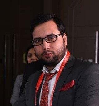
I am RH Fardin, a solo senior web designer in Bangladesh, and for roughly five years I have built sites for the businesses Rajshahi actually runs on — coaching centres and admission-prep institutes feeding off the university, RUET and the medical college, silk and clothing showrooms, clinics and diagnostic chambers around Laxmipur and the Medical area, mango and orchard traders who go quiet most of the year then flat-out busy in season, shops along Shaheb Bazar and New Market selling to customers who pay by bKash and Nagad from their phones.
Every one of those sites had to work first on a small, modest screen, because in Rajshahi that is what the buyer is holding. I personally handle the discovery call, the responsive design across every breakpoint, the front-end build, the on-page SEO, the speed pass and the launch. No junior is assigned to your account, and no white-label partner is doing the work behind a logo.
Genuine responsive design is not one layout that stretches to fit. It is deliberate decisions at each screen size: what stacks and in what order on a narrow phone, where the tap targets sit so an older thumb actually hits them, how the menu collapses, which images load on mobile so the page does not crawl on slow Rajshahi data, how a fee table or product list reflows instead of throwing the reader sideways.
I build mobile-first — I design the phone version properly before I touch the desktop one — and crucially I test it lower than most people do, on the budget and older Android tier a Rajshahi buyer is far more likely to carry than a Dhaka one. A layout can look perfect in Chrome's emulator on a fast laptop and still fall apart on a real entry-level phone with a small viewport and a keyboard popping up over the form.
Pricing is honest and in writing, which in a careful-with-money city like Rajshahi matters as much as the work. The responsive design floor is 50,000 BDT, with tiers at 50,000, 90,000 and 1,50,000 BDT, and fully custom builds from 3,00,000 BDT. I charge 50 percent advance and 50 percent on launch, and I will not chase you for the second half — it falls due when you sign off on the live site.
The design-approval guarantee means I keep refining the visual direction within scope until you genuinely approve how it looks on phone, tablet and desktop. Most quotes around Rajshahi promise "responsive" and quietly deliver a squeezed desktop page from someone who has left the city by the time it breaks; putting the multi-device sign-off in writing is the part nobody else here seems willing to commit to.
See pricing in BDT