A platform ceiling
A website-builder template dictated the layout, the performance, and even the footer, which still advertised the platform rather than the brand.
Rio Day Trip ran a template travel site. I rebuilt it as a fast multilingual platform on Next.js, migrating every URL so the search visibility the operator had already earned carried over intact.

15 pieces of the build, every one a real page from the finished site.
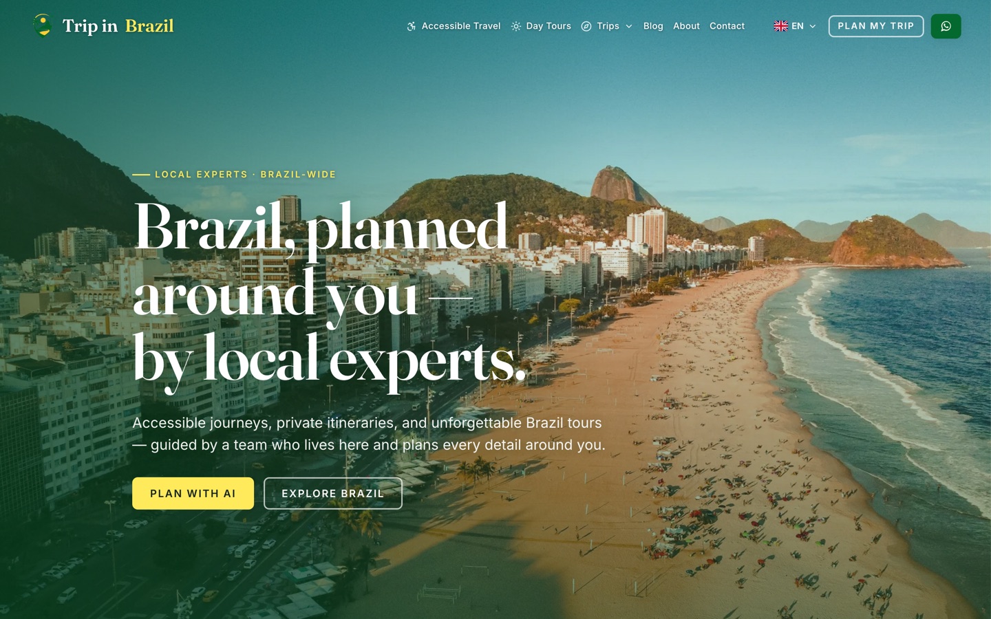
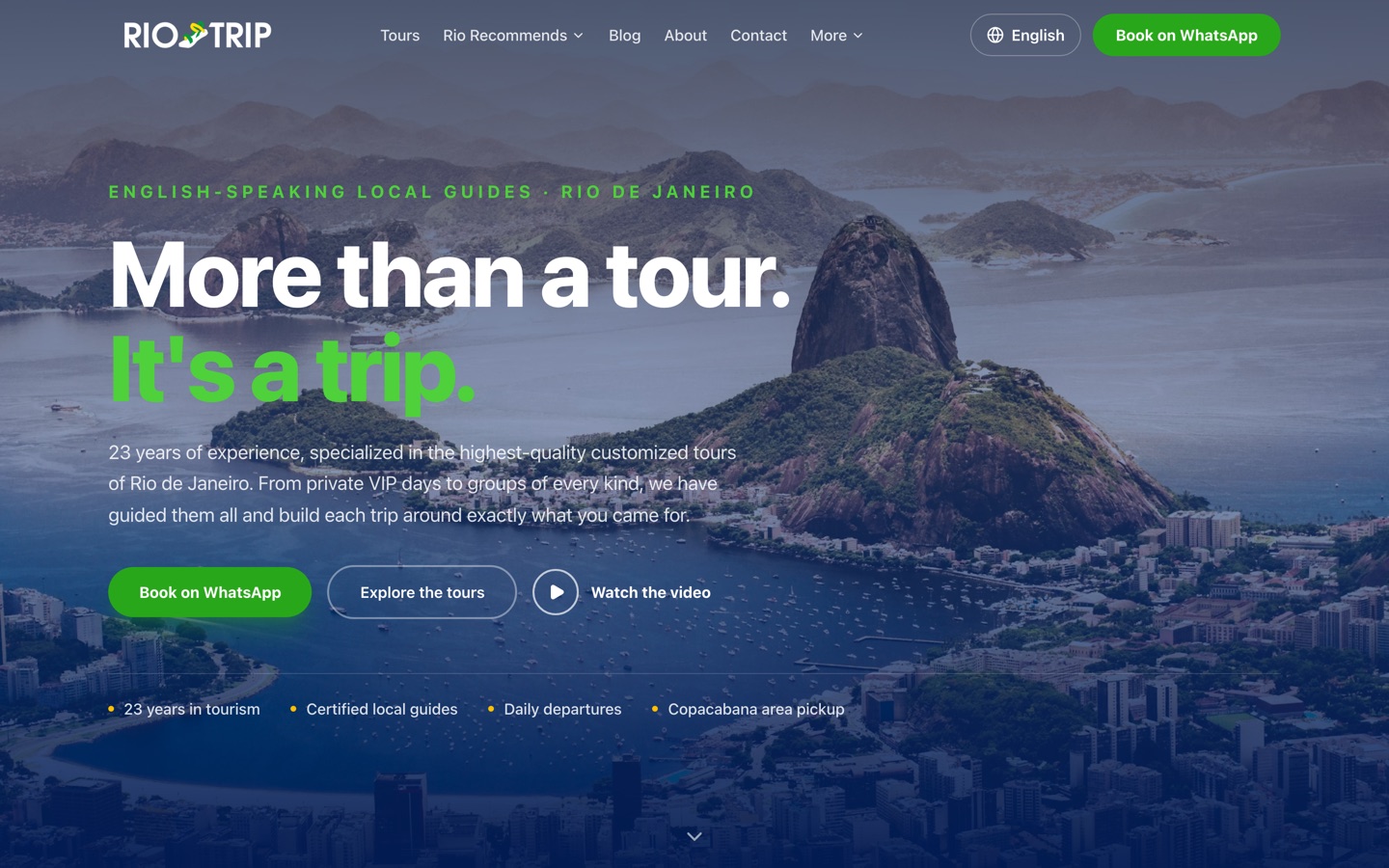
A panoramic hero with a controlled navy gradient, the brand promise given real hierarchy, 4 proof points, and 3 immediate actions. Rubik carries Latin and Hebrew so the identity holds in either direction.
11 coordinated homepage sections
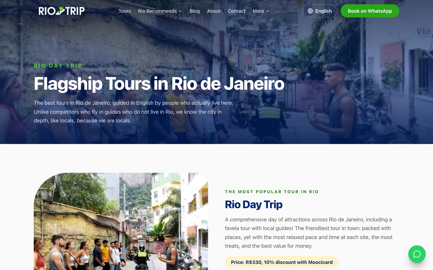
Tours moved out of the homepage into their own index, so a traveler can compare the whole range at a glance instead of scrolling through sections hunting for the right one.
4 flagship tours, 6 recommended experiences
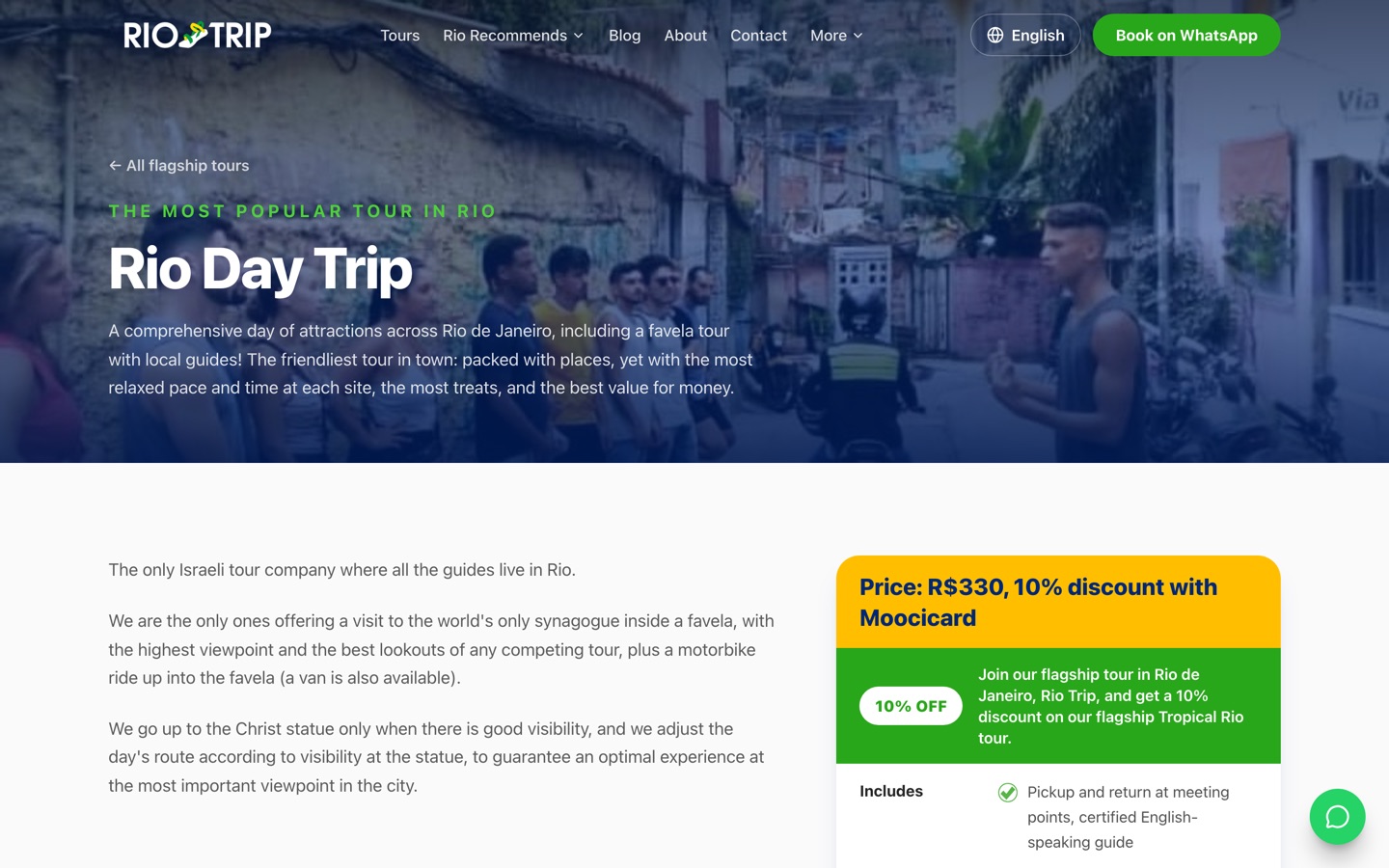
A long-form description, what you will see, traveler quotes, and a structured booking sidebar. The page answers the questions that normally delay a booking before the visitor opens a chat.
1 reusable template across every tour
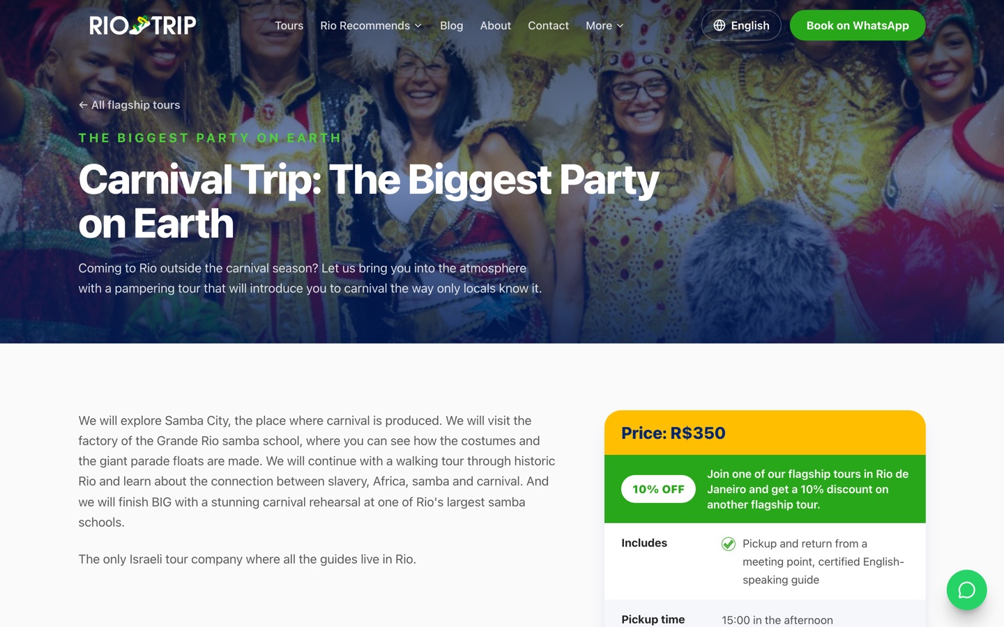
A high-visibility price with the current discount, what is included, pickup time and duration. No hunting, and no messaging the team just to find out what a trip costs.
Price, discount, inclusions and pickup all visible
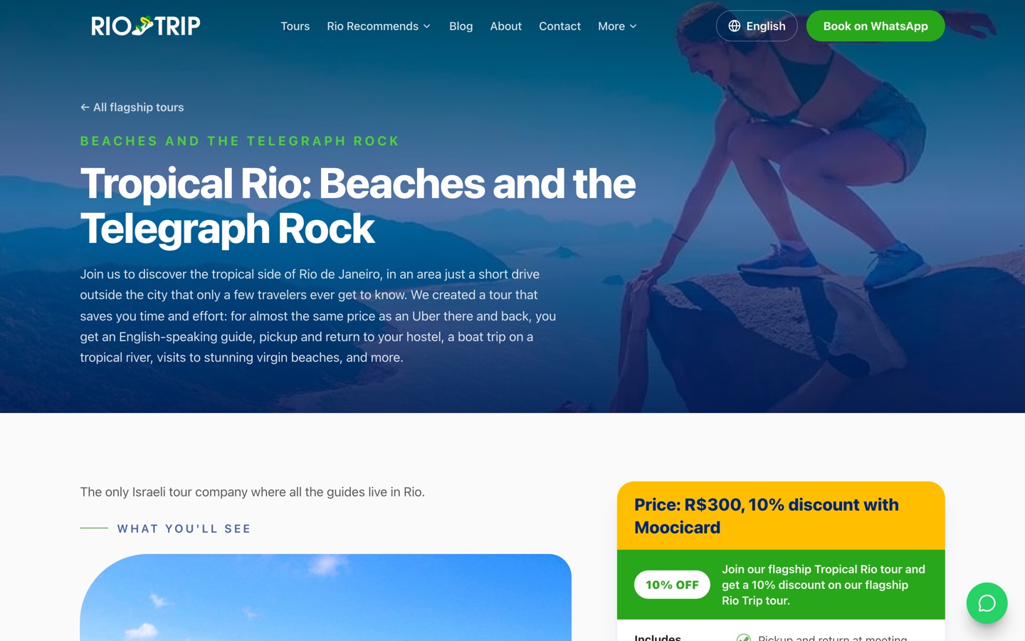
Each tour carries destination photography and what-you-will-see sections, so the experience feels tangible before anyone commits. Real imagery removes doubt rather than decorating the page.
357 images in the project library
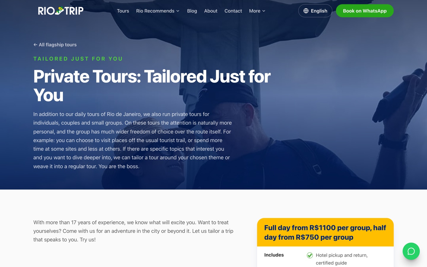
Private and tailored trips get their own page with full-day and half-day group rates, so larger parties can qualify themselves before they ever enquire.
Full-day and half-day group rates published
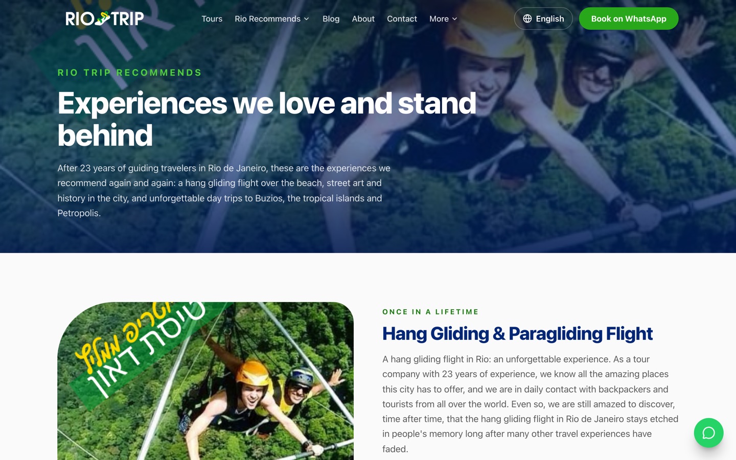
Hang gliding, tropical islands, Petropolis, Buzios and more, each with its own page. This widens the entry points into the site and gives the team more to offer once a traveler has arrived.
6 recommended experiences
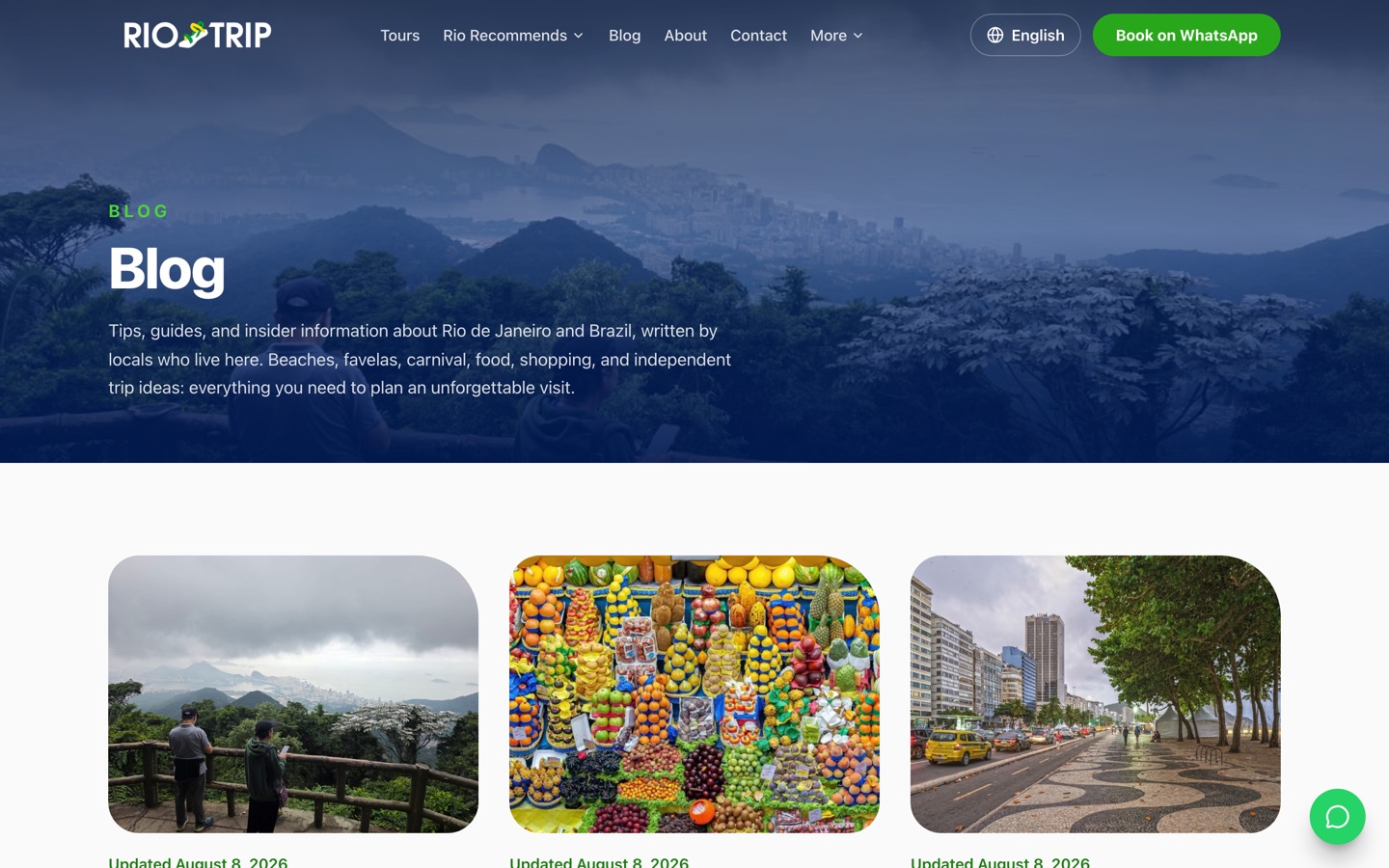
Practical and inspirational articles about Rio and Brazil, tagged into topics that link back to relevant tours, so research traffic turns into booking traffic later.
13 articles, 109 topic pages
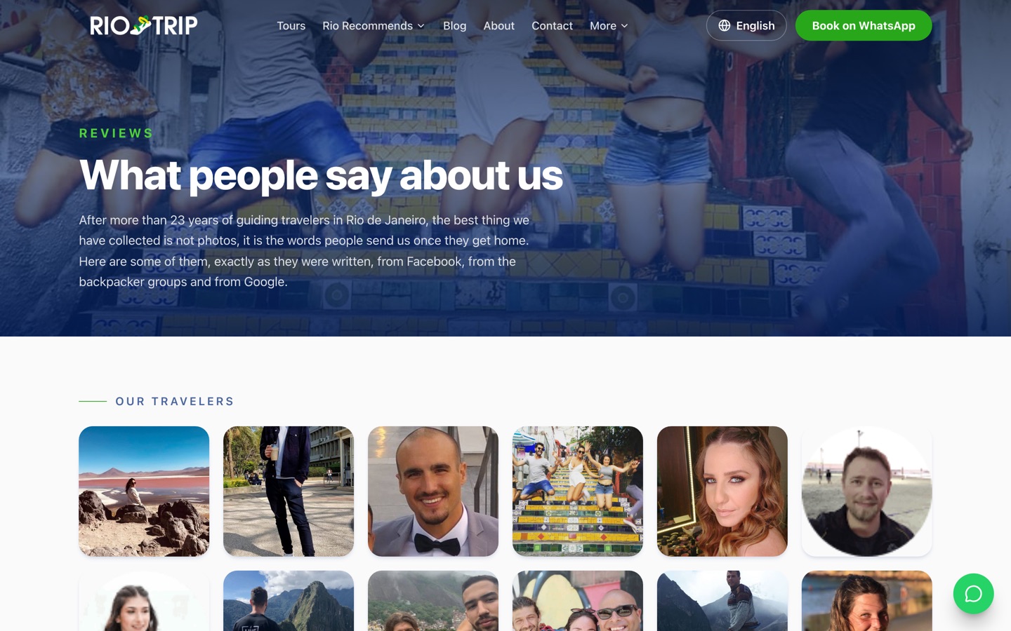
A dedicated reviews destination with traveler photographs and named sources, reinforced by a carousel on the homepage. Proof that is easy to believe and easy to verify.
Reviews page plus homepage carousel
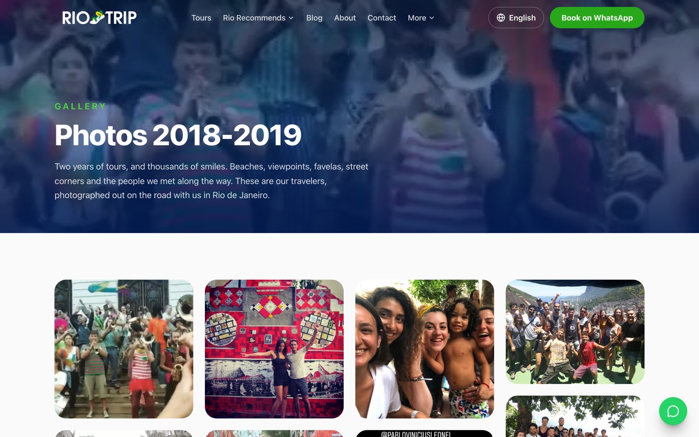
The existing 2018 to 2019 photography was preserved and given modern interaction: responsive masonry columns, lazy loading, a full-screen lightbox, and deep links for historical gallery URLs.
43 legacy gallery URLs redirected, not lost
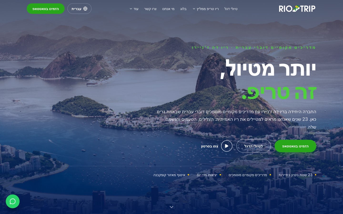
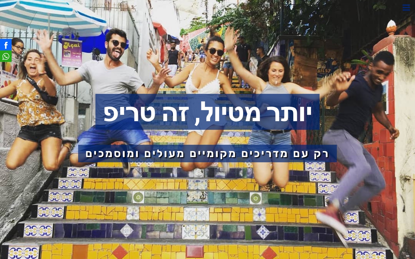
A genuine right-to-left document rather than right-aligned text. Navigation, carousel direction, spacing, icons and animation all reverse, and Hebrew has its own indexed URL space.
2 indexed languages, 5 more selectable
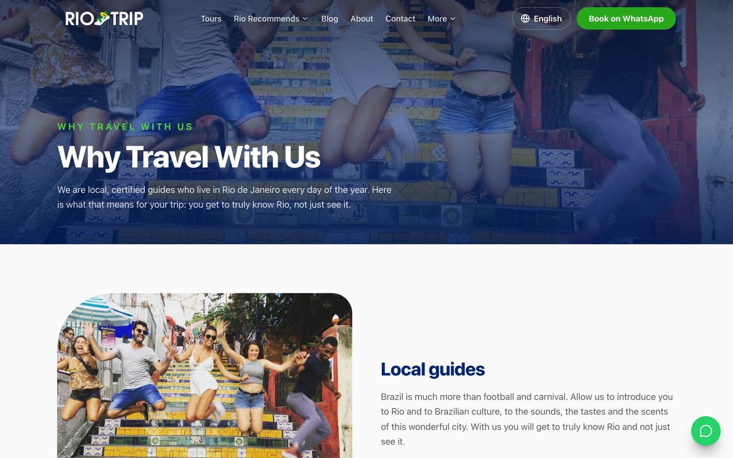
Named guides with roles and photographs, local knowledge, Hebrew-speaking service, and the 23-year history. What separates a local operator from a reseller is people, so the site shows them.
23 years in tourism, 17+ guiding in Rio
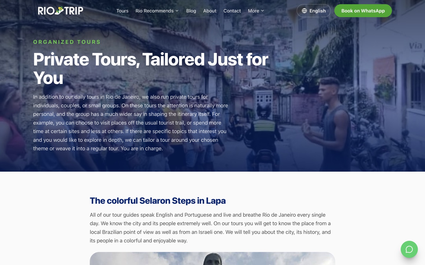
Organized and private group travel gets its own destination, because a family of 4 and a coach party are not making the same decision.
A separate audience, a separate page
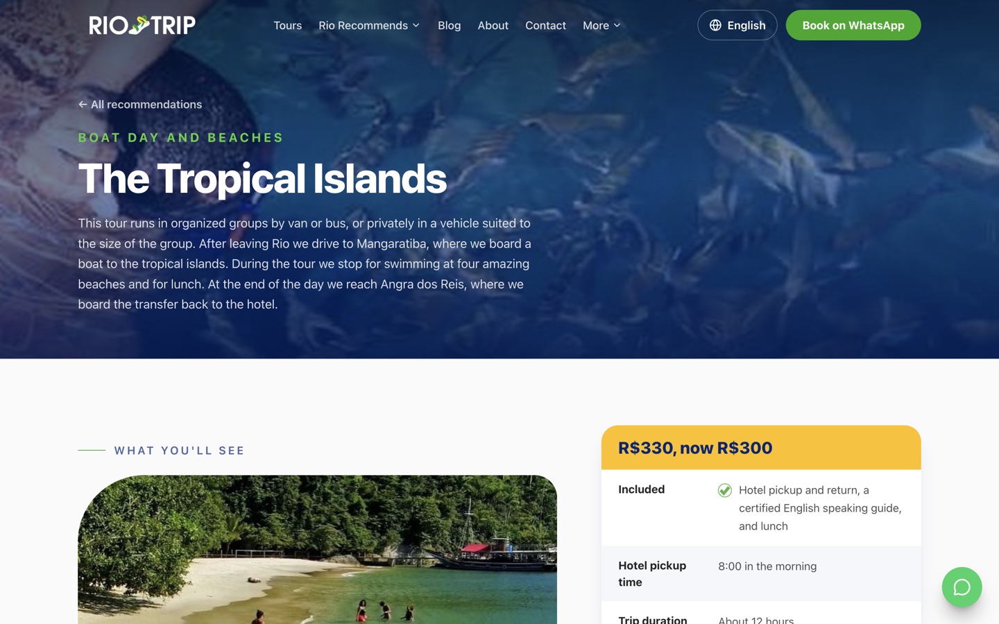
Each of the 6 recommended experiences carries its own imagery, description and booking route, so cross-selling happens through content rather than a sidebar link.
6 experiences, individually built
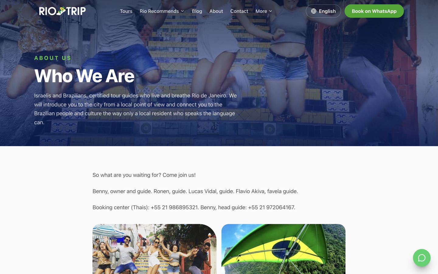
The company story, the team and the local promise, which matters more in travel than in almost any other category.
23 years, told properly
The business had the reputation, the reviews, and the rankings. The website was the part holding it back, and rebuilding it meant putting all of that at risk.
A website-builder template dictated the layout, the performance, and even the footer, which still advertised the platform rather than the brand.
Years of earned visibility sat on specific indexed URLs. Any careless rebuild turns those into 404s and throws the authority away.
WhatsApp was available, but it had to compete for attention with everything else on a very long page.
Every tour lived as a section of the homepage, so travelers could not compare options or land directly on the trip they searched for.
Right-aligned text is not the same as a right-to-left layout. Navigation, carousels, and motion all still behaved left-to-right.
The most likely visitor is a traveler holding a phone in Rio, and template responsiveness was not built around that person.
Each goal set up the next, and the migration constraint shaped all of them.
Replace a template with a cinematic destination brand that loads quickly on a phone with hotel wifi.
Treat the existing indexed URLs as assets to be preserved, not legacy paths to tidy up.
Make the booking channel reachable from any screen, at any scroll position, on any device.
Turn homepage sections into structured pages that answer the questions that delay a booking.
Build a true right-to-left experience rather than flipping the text alignment of a left-to-right design.
Assume the visitor is already travelling, on a small screen, deciding quickly.
Leave a component-based project the business controls, instead of renting a page builder.
Rio Day Trip earned top-3 visibility across Brazil through its own marketing. My job was to move the site without losing it, and these calls made that possible.
Old paths carried odd suffixes, dated wording, and historical spelling quirks. Changing 1 character in an indexed URL creates a 404 and discards the authority behind it, so every one was preserved exactly.
Obsolete and duplicated paths were mapped to permanent redirects instead of being deleted, so neither visitors nor crawlers ever hit a dead end.
When the sale happens in chat, every section of the site should be able to start that chat. Booking is never more than 1 action away at any scroll position.
A generic "hello" wastes the first exchange. Naming the tour in the message means the conversation starts at availability and price rather than discovery.
True right-to-left document direction, with navigation, carousel direction, icon direction, spacing, and animation all reversed. Hebrew reads as native rather than adapted.
A static export means no application server to fail, straightforward CDN delivery worldwide, and a previous build that can be restored instantly if a migration goes wrong.
The unglamorous work that decides whether a redesign keeps its traffic or quietly loses a year of it.
What the production build produces, and what the migration had to account for.
The ranking result is the client's own. The effects below describe what a rebuild of this kind sets up.
23 years of experience finally reads on screen, which is the difference between a local operator and a reseller.
Prefilled messages mean the team opens with availability instead of spending the first replies working out which tour is meant.
A traveler in Rio can compare tours, read the practical detail, and book from a phone without pinching or hunting.
English and Hebrew each have real indexed space, and 5 more languages are available for visitors who need them.
Articles, topics, and recommendations give the business a way to reach travelers months before they are ready to pay.
New tours, articles, and languages slot into an owned component system instead of being rebuilt inside a page builder.
By treating the old URL structure as an asset instead of a mess to clean up:
Because that is where this business actually closes:
More than right-aligned text:
For speed and for safety:
That is exactly the risky part of a redesign, and where most of the care goes:
A rebuild is the riskiest thing you can do to a site that already ranks. I plan the migration before I design a single screen.